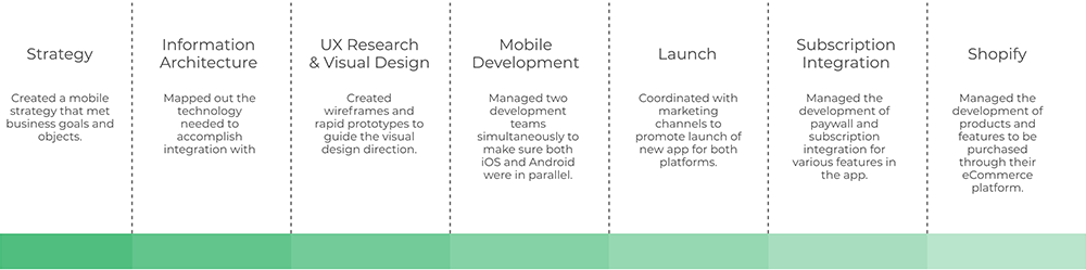
Role
Product Owner, Product Manager, User Experience Designer (UX), User Interface Designer (UI) & Visual Design
Technology
Design & Animation: Figma, Miro, Adobe Creative Suite, Principle, & Lottie .
Programming: .NET Core, Flutter & AI
Deliverables
Competitive analsys, User surveys and one-on-one interviews, User journeys and task flow, Site map, Low-fidelity wireframes, High-fidelity mockups and prototypes, Design system and UI kit, and Usability tests and findings
Milestones
Audience
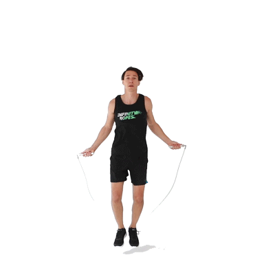
Individuals with tight schedules, allocating only 10-15 minutes for their daily workout routine.
Time Frame
2.5 Years
Overview
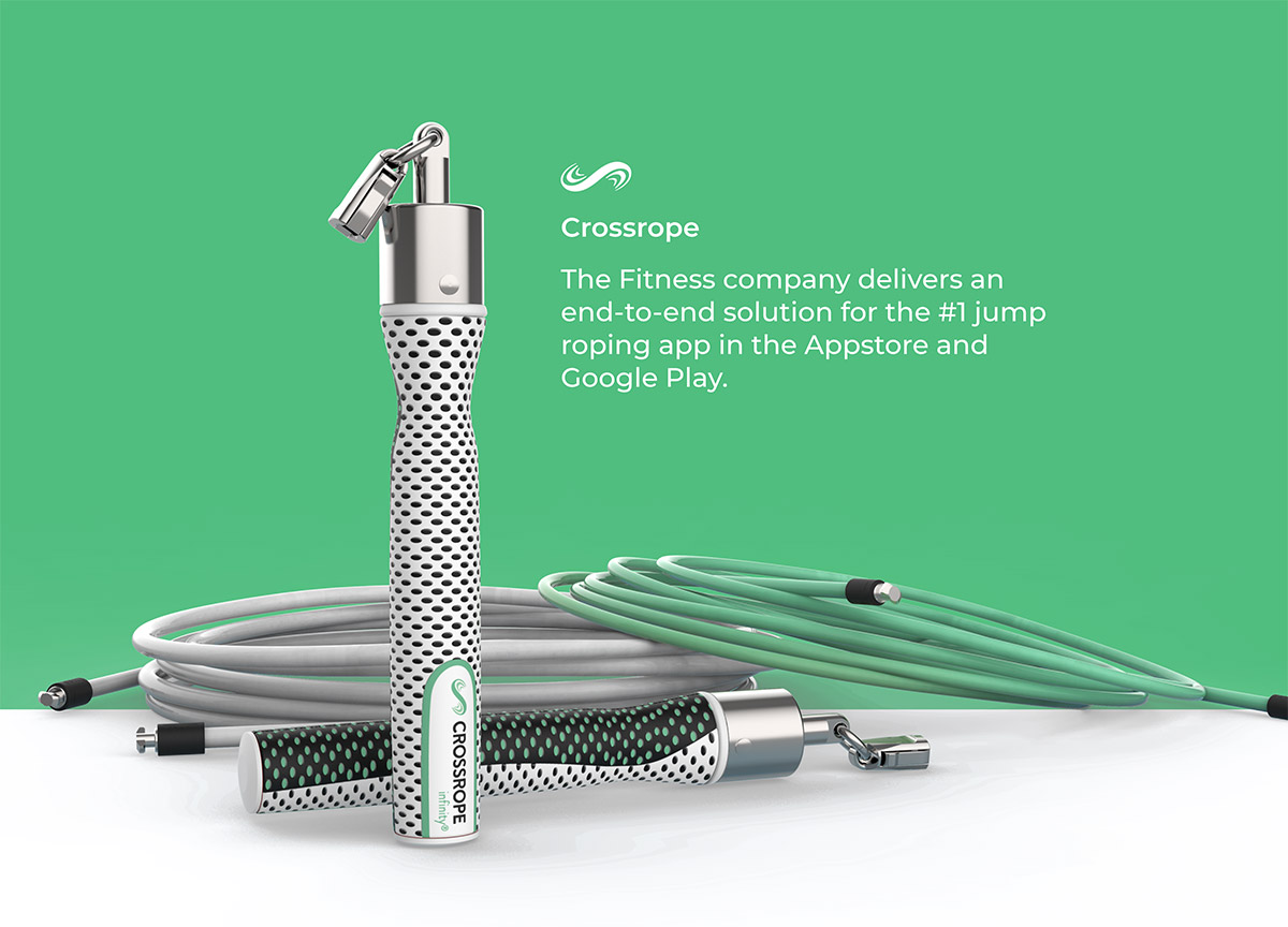
Crossrope innovated a premium weighted jump rope system, crafted to offer customers a dynamic and effective workout experience on the go. To enhance their analog experience, I collaborated with their team to design and develop a companion app that revolutionized the jump roping app space.
Problem
- Difficulty in discovering jump roping workout routines
- Abandonment of health goals due to monotonous routines
- Limited understanding of the jump rope system
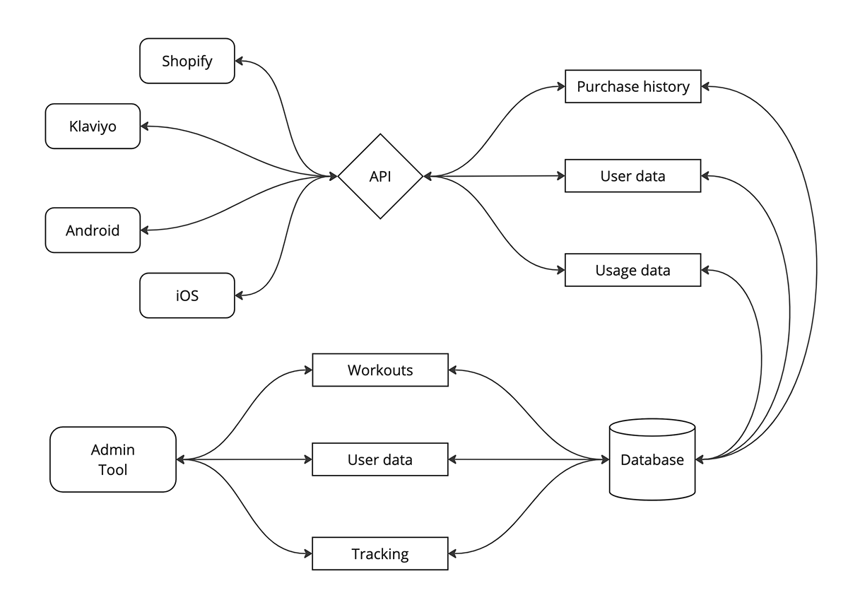
- Lack of seamless integration between platforms
Proposed Solutions
- Innovate a new workout system by eliminating friction
- Facilitate communication and data sharing between platforms
- Implement a web interface for team management of the app
Below, I outline the process of building the App Stores #1 jump roping app.
Identifying the customers problem
To most people, working out isn’t the first thing they think of when they have free time; it can be tiring, strenuous, or boring.
According to a study conducted by the University of Scranton, people abandon their New Years’ resolutions of staying fit by the end of January. It continues to drop every month thereafter. Sticking to hour-long routines multiple times a week can be tough, especially when more important, everyday tasks take up most of your attention.
View research: https://pubmed.ncbi.nlm.nih.gov/2980864/
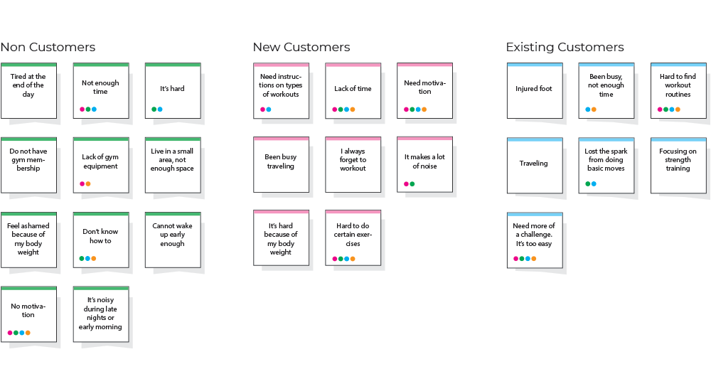
After gathering research from users, I collaborated with the team to create an affinity map, categorizing findings and prioritizing them. This visual roadmap not only streamlined our collective understanding of user insights but also provided a structured foundation for informed decision-making throughout the project. This process allowed the team to delve deeper into understanding their users, fostering a stronger investment in the user's experience. Additionally, it facilitated the building of consensus and nurtured a shared understanding of their customers among team members.
Findings: The constraints imposed by time limitations and the nature of the exercise regimen contribute to users abandoning their pursuit of health objectives.
Creating a new workout program
In order to synthesize our findings, we established a goal: to develop a high-quality fitness program that is brief, impactful, and efficient. This approach reimagines the workout experience, allowing individuals to engage in their fitness routines outside of the gym by leveraging portable jump ropes and the Crossrope mobile app. Our aim is to empower users to seamlessly integrate their fitness goals into their daily lives, fostering a healthier and more adaptable approach to exercise.


Auditing their current system
Upon conducting an analysis of their existing experience, it became evident that their ecosystem lacked scalability. The disparate nature of each product operating independently resulted in friction across the overall user experience.
I formulated a strategy aimed at seamlessly connecting each touchpoint within the customer journey. This initiative was designed to enhance cohesion and synergy across their product ecosystem.
Research and iteration
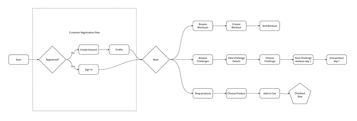
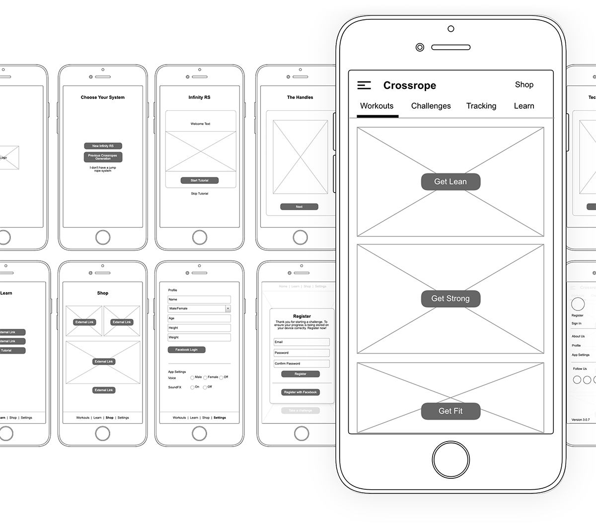
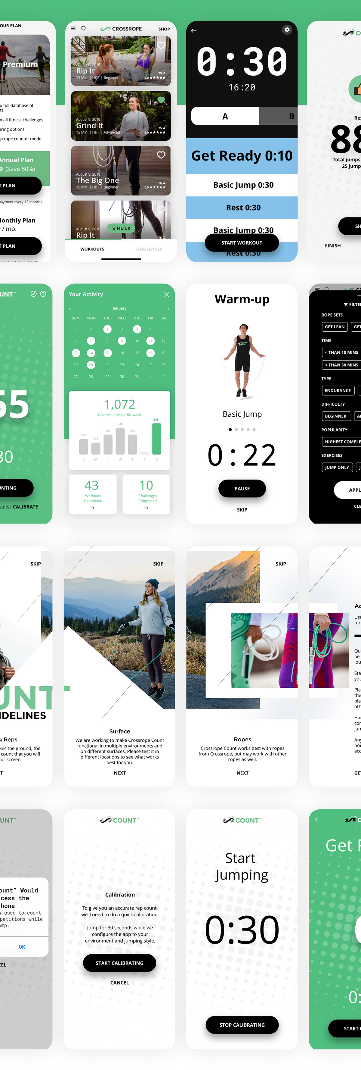
I generated user flows to chart the complete user experience of the app, ensuring a thorough comprehension of the user journey. Simultaneously, I actively worked on crafting wireframes to envision the app's optimal user experience. The creation of prototypes played a pivotal role in refining our understanding of essential functionalities, thereby directing our approach in the design phase. These dynamic prototypes not only served as tangible models for conceptualization but also provided a collaborative platform for the team to iterate and fine-tune features based on real user interactions.
This collaborative process involved regular brainstorming sessions and cross-functional discussions to ensure that diverse perspectives were considered. Through this iterative process, we harnessed valuable insights, ensuring that our design decisions were not just informed by theory but were grounded in the practical nuances of user engagement and satisfaction. Each iteration brought about not just refinements but also a deeper alignment with the overarching user-centric goals.
User testing
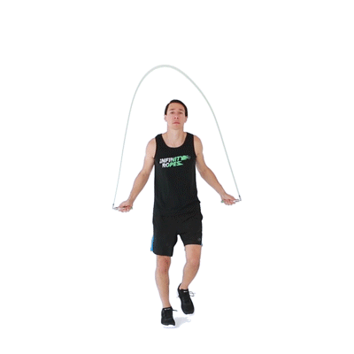
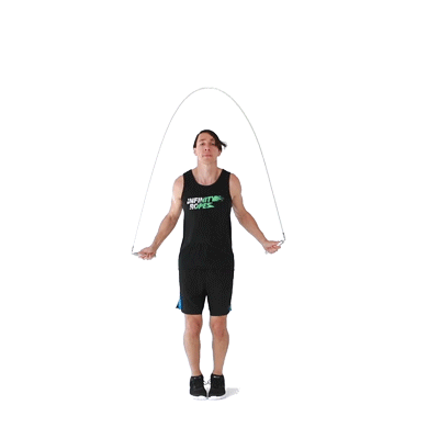
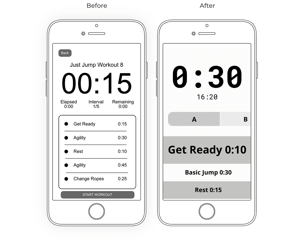
During the wireframing phase, my initial sketches envisioned screens tailored for a standard app experience, presuming the device would be positioned 8-12 inches from the user's view. Although this assumption held true for the majority of the experience, we overlooked the necessity for visual feedback during workouts. In the context of jump roping, users typically place their phones at a distance, posing a challenge for clear visibility.
Throughout the workout experience, users heavily depended on larger visual cues to discern when to switch ropes or alter exercises during their session. This realization prompted a reassessment of our design approach to better accommodate the unique spatial dynamics of the workout setting. Also, recognizing the importance of accessibility, we incorporated audio cues, ensuring that users could receive guidance and prompts even when visual cues were challenging to perceive. This adjustment enhanced the overall inclusivity and usability of the app.
The user experience
Elevating the customer experience is a fundamental aspect of crafting a superb product. To facilitate seamless navigation tailored to individual needs, we opted for a straightforward design.
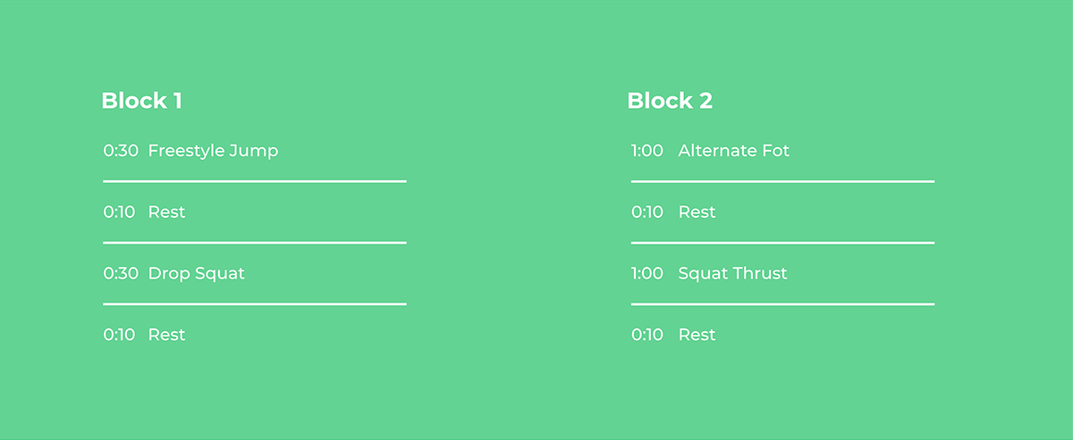
Within the workout context, color played a pivotal role in associating types of ropes with specific intervals, empowering users to effortlessly identify the appropriate rope for each segment.
Moreover, a cool featured that we added harnessed the power of AI to discern distinct sound profiles from both the rope and the ground, enabling accurate counting of jump rope revolutions. This technological integration added precision and efficiency to the user's workout experience.
Results
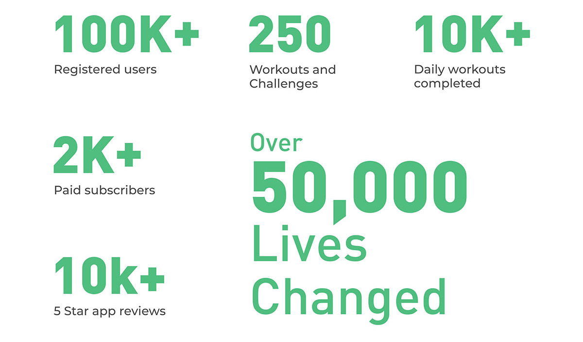
After six months since the app’s launch on both iOS and Android app stores, we’ve witnessed a remarkable shift in user data that has truly transformed the game. We’ve evolved from having a mere idea to crafting a better fitness program catered to the jump rope community. This evolution has not only assisted thousands in their fitness journeys but also continued to inspire new customers to embrace jump rope as a fun and convenient means of achieving their daily fitness goals.
How usability might be improved
Considerations for sustained development include addressing issues that may arise over an extended period, ensuring the longevity and continuous improvement of the app.
1. Workout Routines
Implement advanced filtering options to facilitate the discovery of workouts efficiently. With the growing repertoire of workouts, there's a necessity for a more user-friendly display, enhancing the browsing experience.
2. Tracking
Introduce enhanced data visualization techniques for displaying metrics that track user usage, providing a clearer and more insightful overview.
3. Prompts
Incentivize users to explore diverse workout routines through encouraging prompts, fostering a sense of variety and exploration.
4. Beginners
Establish a dedicated section tailored for users who are new to jump roping, offering a resource to learn tricks and techniques, ensuring a smooth initiation into the jump rope community.
Lessons Learned
1. Perspectives
While most apps are designed for viewing within the typical range of 8-12 inches, I've discovered that users often place their phones at a distance during certain activities. This shift in viewing distance necessitates the incorporation of larger visual and audio cues to ensure seamless interaction.
2. Bridging Analog and Digital Realms
Transitioning from the physical to the digital realm can present challenges, particularly in ensuring harmony between the two. I've realized that while we may not control the events in the physical world, anticipating and aligning with the digital realm's dynamics is crucial for a smooth user experience.
3. Managing Abundance
The ease of creating information brings the risk of information overload. The abundance of workout routines has grown significantly, and without proper checks, it can become overwhelming. I've learned that emphasizing quality over quantity is paramount in maintaining a well-structured and effective system.
4. Collaboration
The crux of any project lies in the strength of collaboration within the team. I've come to understand that building and nurturing these relationships requires an investment from the start, fostering open discussions throughout the entire design & development process.